Dear Reader,

Well, it’s 2025.
It’s also the first Monday of January, which, in my opinion, should be considered the unofficial first day of the year. The first day you’re expected to do things, to “get back to normal,” whatever normal means to you.
I am finally feeling (almost) back to normal. I’m always a little homesick after returning from Vancouver, taking a while to adjust to a different environment. But today I woke up at 9:30 am instead of noon, did my morning pages, and had my oatmeal with blueberries for breakfast, and I did my daily watercolour painting. (My goal is to do one every day this month.)
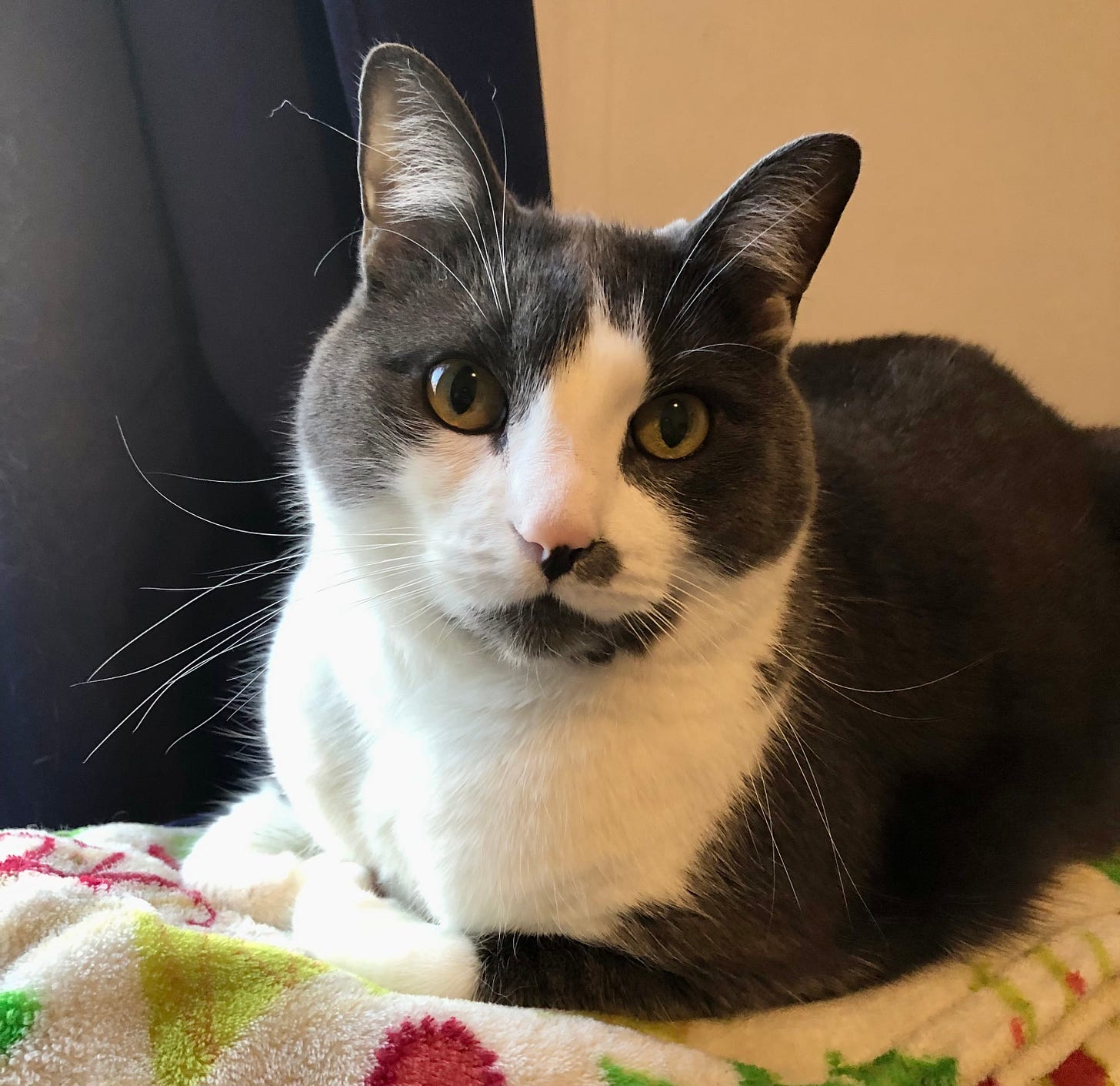
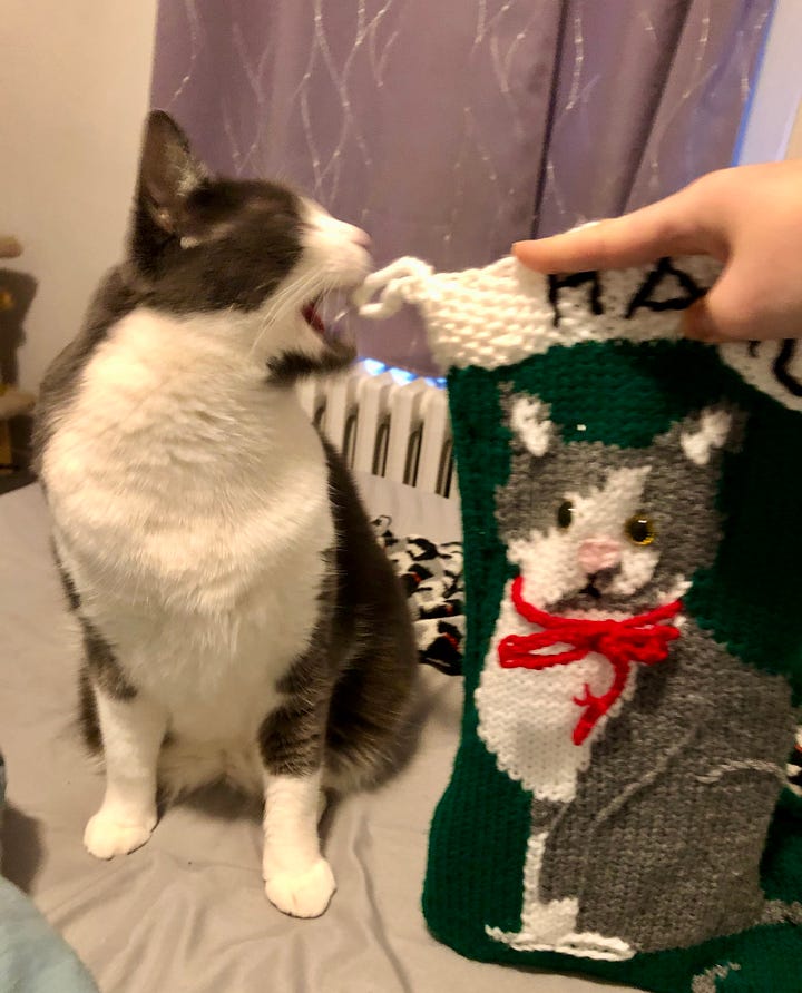
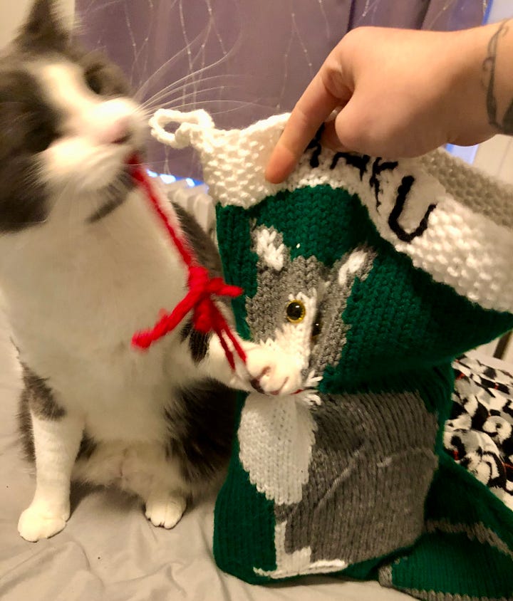
And of course, I’m back with my favourite little guy/furry coworker:1
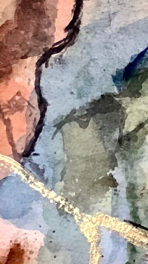
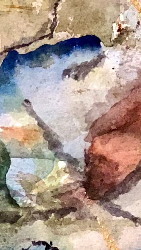
For my first newsletter of the new year, I wanted to share with you one of my favourite paintings I made this year! It’s one that I made for my dad for Christmas, and one of the few larger (22 x 15 inches) watercolour paintings I’ve done.
It was also a good lesson in trusting the creative process.
I really wanted to do something that was vaguely Lord of the Rings2-like while still being abstract. I decided to use the three colours of this extended edition DVD box set—this part army, part forest green, a burnt sienna, and this lovely royal blue.
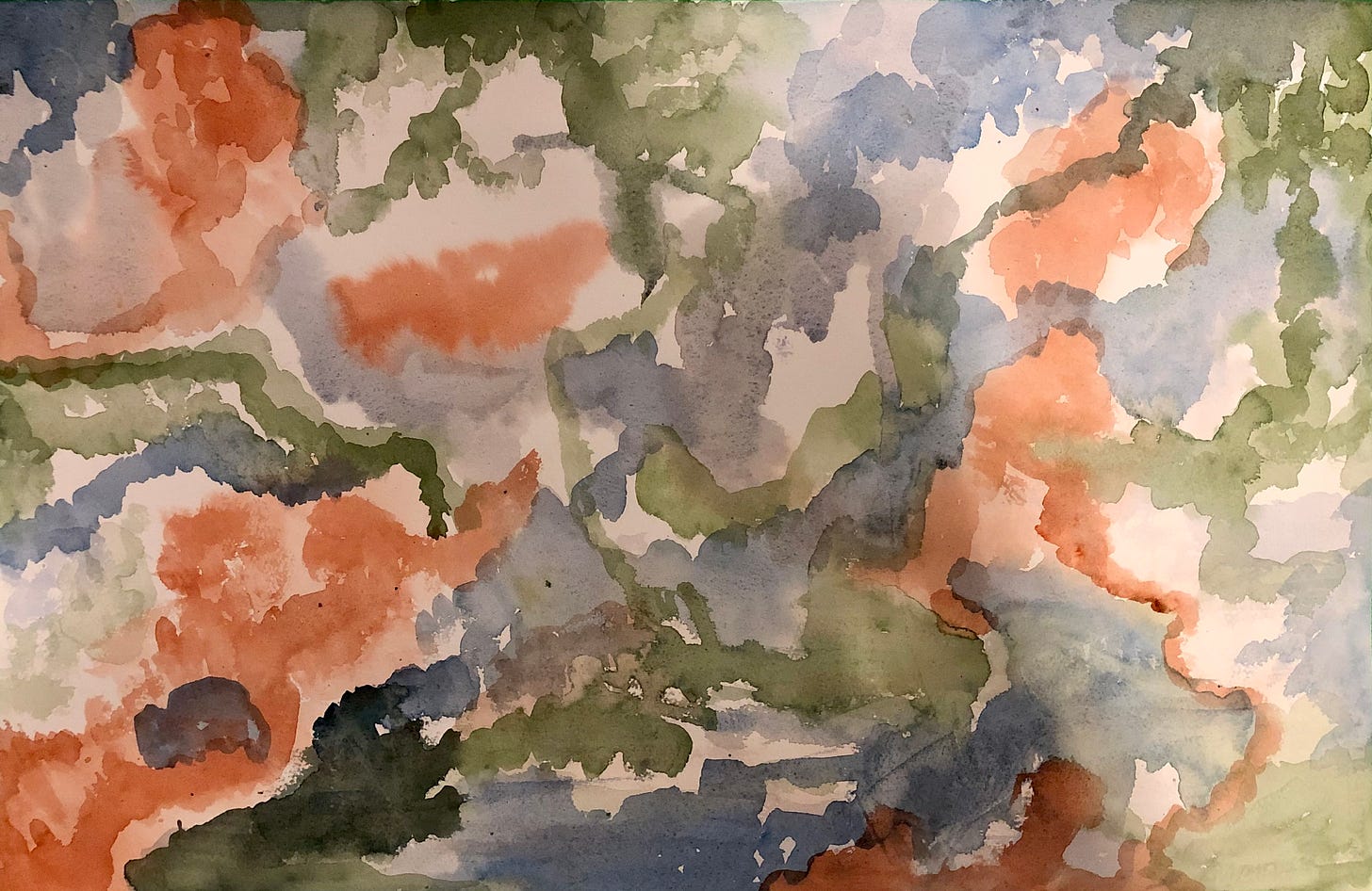
First Layer
I focused on blocking in the three main colours, not having a clear idea of the composition but trying to let it emerge naturally.
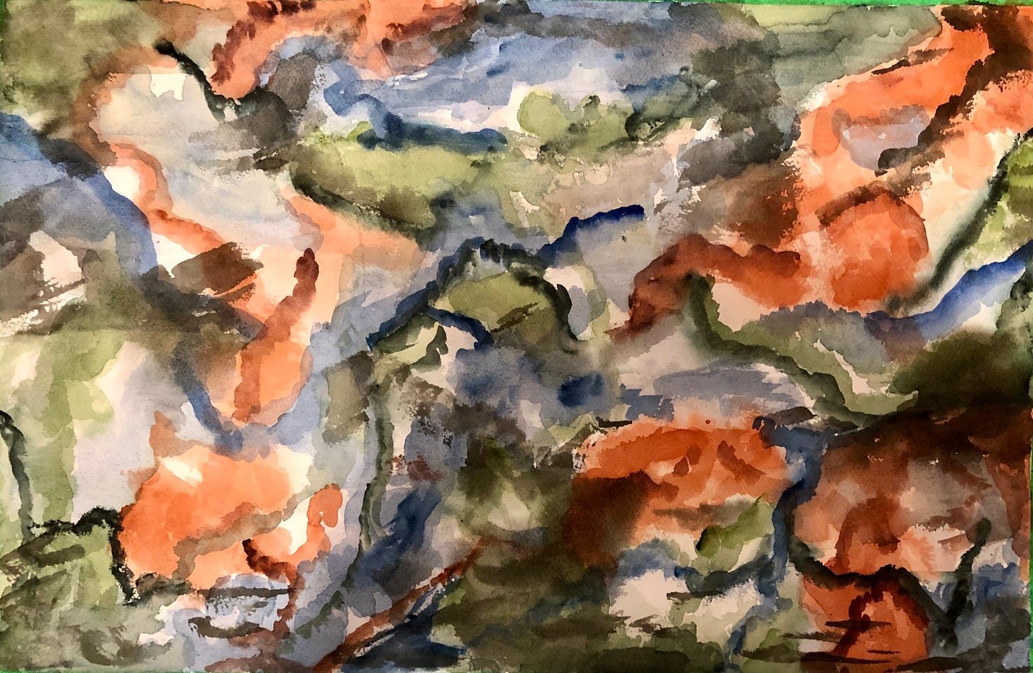
Second Layer
I went in with some darker shades, trying to make the colours a bit brighter and richer, and added some details to try to define the composition more. But I ended up with this weird dark splotch on the right side, and I decided that the whole thing looked like a mess and I hated it.
I put it on top of my bookshelf where I couldn’t see it, then decided it might be more helpful to put it back on my easel, giving the painting space while still keeping it in the back of my mind. Hoping that after a few days, I might be able to transform it into something I at least kind of liked.
Third Layer
Okay, let’s see if we can fix this baby.
First, I did a really light neutral wash over the entire thing to try to make the colours more muted and earthy, while still maintaining some of their vibrancy. To be honest, I don’t think it did anything.
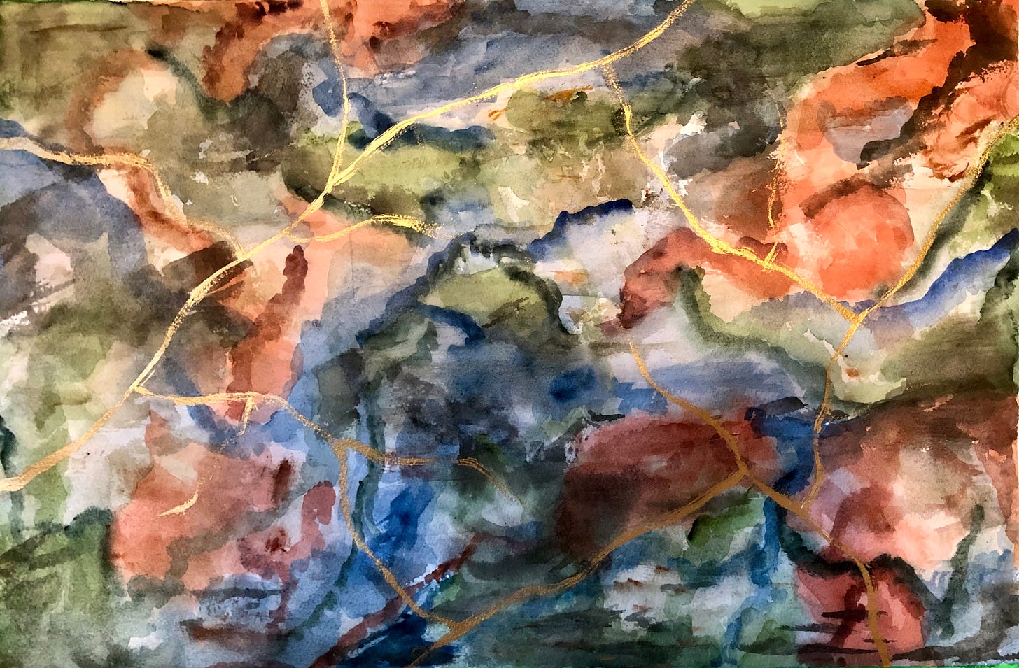
But then I added some branching lines of gold acrylic paint, which I thought gave it a more Lord of the Rings feel and enhanced the whole fantasy map/landscape style I was going for. It definitely improved the whole thing, but I still wasn’t super happy with it. Something was missing…
Final Layer
“Don’t be afraid to go darker” is a piece of advice I remember hearing from at least a couple of watercolour instructors (either on youtube or through an online class).
So, I decided to do another layer of stronger darks, adding definition to some of the emerging mountain-like shapes and creating more contrast.
HOLY FUCK DID THAT MAKE A WORLD OF DIFFERENCE.
I loved the final result:
All of a sudden, the whole piece seemed brighter and more vibrant, more interesting.
I’ll remember that for next time—don’t be afraid to go darker. Add the darks to bring out the light! Metaphors!
And also—
the creative process can be sticky and confusing and swing back and forth between love and hate very quickly. But I’m slowly learning to trust that it will always be there for me in the end—I just have to show up and let it.
Wishing you a week of finding new art that you love. And kittens. All the kittens.
Love,
If you’d like to support me and my dream of making a living from my art, you can do so through my kofi page!
While not a Christmas movie, a Lord of the Rings marathon is one of my favourite holiday traditions.


