


3 Ridiculous Font Hacks for Writer's Block
Desperate times call for desperate typography.

Dear Reader,

It’s always neat when you find a new strategy that aids in the artistic process, something that helps you over that little hump of shame or self-doubt. Especially when it’s unexpected or arises from a moment of play and experimentation.
Like many of the things I do, needlessly playing with and changing up the fonts on an online document tends to be a way for me to procrastinate actually writing. But sometimes, just making that small physical change somehow helps shift something in my mind and allows me to write a little more freely. And maybe some of these changes will be helpful to you too.
1. Write in a font that’s so unnecessarily fancy that it’s impossible to read
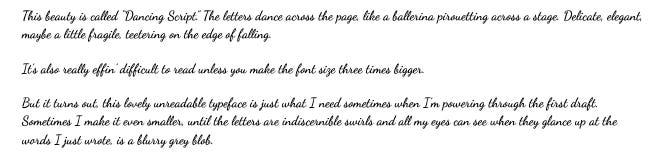
Like this! Don’t worry about trying to decipher it, I’m not evil. Here is it transcribed:
This beauty is called “Dancing Script.” Like a ballerina pirouetting across the stage. Delicate, teetering on the edge of falling.
It’s also really effin’ difficult to read unless you make the font size three times bigger.
But it turns out, this lovely unreadable typeface is just what I need sometimes when I’m powering through the first draft. Sometimes I make it even smaller, until the letters are indiscernible swirls and all my eyes can see when they glance up at the words I just wrote, is a blurry grey blob.
2. Change the text colour to white, or the background colour to black so you can’t see what you’re writing
If you’re not into curly fonts (or comic sans), just change the text colour to white or a very very light grey for even greater unreadability! Because sometimes even with a difficult-to-read font like Dancing Script, I can’t help but try to read and agonize over the words, even if it results in a bad headache and probably worsening my already terrible vision. But having no visual reference at all makes it easier to get out of the habit of reading over what I’ve written before I’ve gotten through a draft.
3. Write in Comic Sans (My FAVOURITE hack)
A few years ago, during a late-night doom scroll through Instagram, I came across this post:
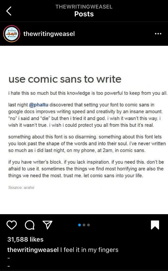
I’ve never had particularly strong feelings towards Comic Sans. Prior to seeing this post, I had only heard whispers on the Internet on why you should never, ever use this font lest you want to remain a sad and unemployed human. It’s unprofessional and childlike. Stay away from this font at all costs! Let it cease to exist from collective memory. (I thought that was a bit harsh.) I’ve always preferred Times fonts myself, so I never gave comic sans much thought.
Until one night, shortly after. I was trying to squeeze in my daily journalling and since it was 11 pm and I just wanted to get it done and go to sleep, I decided typing would be easier. I remembered this post, and decided on a whim to switch my font to Comic Sans.
I wish I could say that switching fonts made a light switch turn on in my head, as if the creative blockage was cleared and the words began to pour out, faster than they ever had before. That the writing gods rained down their magic on me.
What actually happened was that as my fingertips plodded over the keyboard, slowly tapping out words, I found myself smiling at this infamous font. Something about the shape—the smooth curvature of the letters with their rounded ends and the perfect felt-tip marker thickness—made it easier to be gentle with myself.
It reminded me of primary school—of chalkboards and and wax crayons and duotangs (even though you cut yourself on those stupid metal tags at least once) and art projects and how satisfying it was to watch the teacher write on the white board or those flip chart stands with a big fat marker, and class brainstorming sessions and new school supplies. Oh, and for some reason, those super cool big bubble wands.

It made me think of that period where I was obsessed with American Typewriter font and used it for everything. How Lucida Calligraphy was always for fancy titles and headers. The stupid amount of fun I would have in computer class trying out every possible font there was available, trying to decide which one I liked best.
As for actual writing, I did write a great deal more than I intended to that night. Mostly because I started rambling on and babbling about fonts, as I’m doing right now. There’s just something so disarming about Comic Sans. LOOK HOW APPROACHABLE I AM, it says, tugging at the hem of my shirt to get my attention. LOOK AT THIS PICTURE I DREW OF A LAMP. LOOK AT THIS TAP DANCE I MADE UP.
But for me, the biggest thing is this: this font made me want to play. Play, as in mess around—with words, paint, crayons—make mistakes and laugh about them and dive in head first and marvel at the fact that I am creating something. So much of my experience with art and writing the last few years has been learning how to play again. Learning how not to ruin things for myself. Teaching myself to be a child again, to get excited about small things. Which makes Comic Sans—this lovely, unprofessional, childlike font —a perfect match for me: a tightly wound writer who, even as a child, was never very good at being a child.
Comic Sans didn’t make the writing gods rain down their magic on me—and, despite our new friendship, I will not be using it for my next batch of resumes and cover letters—but it did spark something new in my mind. It helped the words flow a little more smoothly, a little faster, reminded me of how simple things can be when I don’t complicate them for myself. How fun it can be to play in the sand. Maybe this effect will go away eventually, once the novelty wears off. But for now, Comic Sans and I are best buds with all the time in the word. It makes writing a little more fun. It makes me excited to play in the sand. And right now, that’s everything to me.
Let me know if any of these work for you, or if you have your own tips to share!
With love and gratitude,

Love what I do but not ready to subscribe? You can support my work with a one-time tip through Ko-fi - every “coffee” helps me keep creating!
I loved reading this! (I hilariously actually read the dancing font before I moved on and it was tough but I love that you explained all that in your next paragraph!)
I am a great lover of changing fonts to inspire myself. I used to do it while making posters and would often create a hilarious nightmare page of fonts.
My editor wanted my book in Times New Roman and I wanted to say…but how about this weird font I bought the rights to in 2021?
But I resisted. I wish I hadn’t. I wish I could use typewriter fonts for everything.
Anyhow. This piece really made me feel joyful. I don’t need writing hacks, as I can’t stop writing, but this piece made me feel like I’d been gifted some ideas for play, and that is exactly what I needed.
I love Comic Sans. I did learn never to use it at work though. Not even for email😕